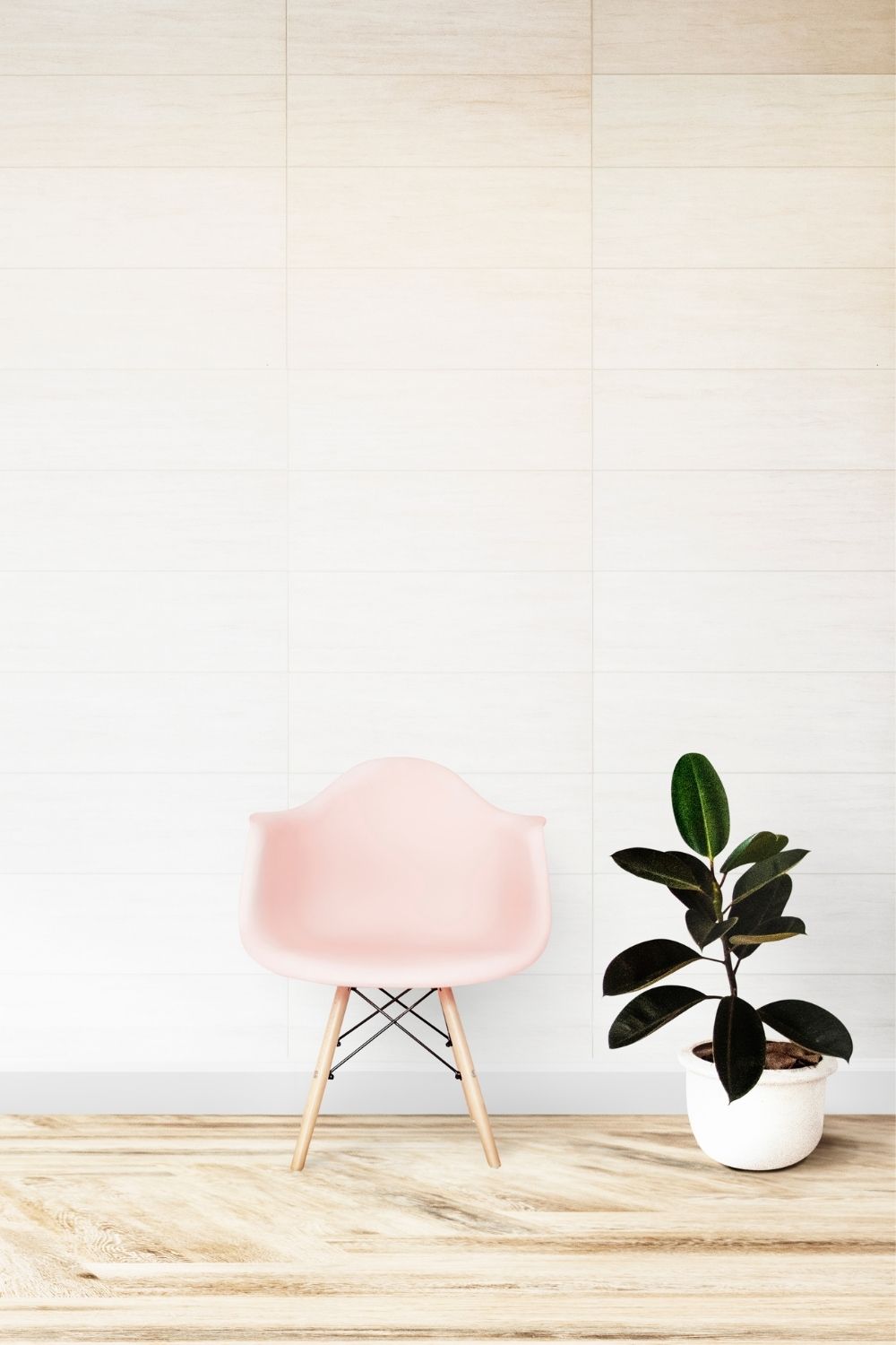
Less is more may sound like a cliché, but with the minimalist design trend, that’s the essence of this school of design. As a design movement, minimalism is still relatively new, having only come into its own in the late 1960s and early 1970s, particularly with American visual art.
In its most stripped-down definition, minimalism is about designers expressing only the most essential and necessary elements of a product or subject by getting rid of any excessive and, therefore, unnecessary components and features. As with many other movements, the minimalist design trend is a reaction to and rejection of an earlier design philosophy that fell out of favor.
Minimalism is all around us. You can see it anywhere from the user interface of your favorite website or app to the package design of your latest gift and the design on the cup of your favorite cup of coffee.
Here’s a look at minimalism, its history, and some stunning examples of this design movement.
Where Did the Minimalist Design Trend Come From?
Minimalism was a rejection of the extremely subjective designs and works of abstract expressionism. By distilling a product, painting or subject down to its bare essentials, minimalists wanted to showcase its true form. Abstract expressionism is an approach to design that combines self-denial and emotional intensity, which produces designs that some see as chaotic, rebellious, and even nihilistic. Unsurprisingly, spontaneity (or at least the impression thereof) is the main feature of abstract expressionism.
Minimalism, in stark contrast, takes form, color, and space and reduces them to such simplicity to attain their essential nature. At this point, the philosophy goes, one can’t remove anything else from the design to improve it further in any way, shape or form. That’s when you know that true minimalism has been reached. Call it a form of design nirvana, where bliss in design is attained by removing all of the excesses!
A group of artists in New York in the 1960s began to put this school of design on the map when they experimented with what’s known as geometric abstraction. Their minimalist art focused on geometric shapes and forms—and you can see why this naturally gave way to minimalism. Geometric shapes and forms are as basic to human comprehension as it gets.
Interestingly, this geometric abstraction was already present in the heyday of Islamic art, many centuries before geometric abstraction and the ensuing minimalist design trend ever hit European or American shores. Since the depiction of religious figures was not allowed in Islamic art, Muslim painters had to rely on geometric shapes as a method to associate religion with both art and science—which was a big theme in Islamic art.
Minimalism’s Connections to Other Influential Design Movements
When you study the roots of minimalism, you begin to notice overlaps and associations with other noteworthy design movements in human history. This is natural because trends usually borrow from and are inspired by one another.
In the case of minimalism, its European origins are found in the geometric-abstraction creations of painters who were associated with the Bauhaus movement. One of the mottos of Bauhaus was the famous line, form follows function, which stresses that any design should put a priority on usability and any aesthetic considerations should come in second. Painters such as Piet Mondrian and Kazimir Malevich are standout examples, as well as artists who were associated with the De Stijl movement (which translates to “The Style”), a design trend whose roots date back to 1917 Leiden, in the Netherlands.
De Stijl was also connected to Swiss Design, which in and of itself has made a tremendous impact on design in the 20th century and beyond. Swiss is noted for its dedication to order and cleanliness (the grid system or organizing content), readable and legible typefaces, and copious use of white or negative space to focus attention on the actual content.
Another related design movement is Scandinavian design, which you can’t ignore when discussing minimalism. This aesthetic emphasizes minimalist mainstays like:
- Simplicity in design to serve overall function
- Clean lines and compositions
- Bright and natural lighting
- Lighter and more neutral colors
- Natural flooring (as well as nature themes like leaves, trees, etc.)
No discussion on minimalism would ever be complete without a reference to Japan’s traditional culture of Zen philosophy. When we say “Zen” in today’s terms, we often think meditation and calm; however, in design terms, Zen is the epitome of minimalism, especially the way Japanese designers use it.


